Pick lists
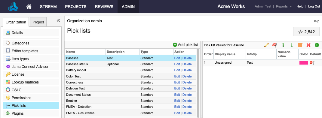
Pick lists are a set of specific values that you can enter into a field. This feature ensures that all users enter field content correctly. Pick lists are also useful when you create lookup matrices and calculated fields.
Each pick list must be assigned a name. An optional description defines how the pick list is used.

Each option in a pick list can be assigned the following:
Order — The arrangement of options in a field drop-down menu list.
Display — The words users see when they select pick list options.
Infotip — (Optional) Custom text that provides context for that value and is visible when a user hovers over this field label.
Description — Explanation of an option's meaning. For example, a display of High might be described as "over 5000 items," "625-750 degrees," or "at least 72 miles."
Pick list type — Standard type pick lists can be used for pick list, multi-select, calculated, or status fields. Only Lookup matrix type pick lists can be used to configure lookup matrices.
Value — The addition of a numerical value or weight to each option, which is useful in creating calculated fields.
Color — A means to visually distinguish pick list options at a glance, visible in different views across the application. For example the test case status field colors are green (passing), red (failing), and orange (blocked).
Default status — The status value that appears by default. A pick list can have only one default status.